Since the extent of the sexual assault, sexual abuse, and general misuse of power by men over women in the Hollywood film industry became more widely acknowledged in 2017, few areas of public life remain unexamined. Scandals continue to be uncovered in politics, business and the charity sector, and women appear to be emboldened not only by these stories and the emergence of certain important social-media trends, but also by a sense of urgency engendered by the scale of the abuse alleged, and by the power wielded by people such as the self-confessed “pussy grabber” in the White House.
The beer world has not been spared this scrutiny.
It is for women in the beer industry, from bar staff through beer writers to brewers, to relay their experiences of misogyny. For men such as me it is sufficient to acknowledge that it ranges from not being taken seriously, at best, to sexual assault, at worst. To do anything other than express support would be crass.
Nonetheless, I may have something useful to say about the misogyny that disfigures so much beer-marketing imagery. That is what I will try to do in this article.

In 1964, the U.S. Supreme Court Justice Potter Stewart came up with a famous heuristic for determining whether or not an image should be considered “hard-core pornography”, and therefore obscene.
“I shall not today attempt further to define the kinds of material I understand to be embraced within that shorthand description, and perhaps I could never succeed in intelligibly doing so,” he said. “But I know it when I see it, and the motion picture involved in this case is not that.”
It is tempting to apply the “I know it when I see it” heuristic to the question of whether imagery is misogynistic or sexist. We would all like to think that we would instinctively “know it” if we saw some imagery that fell on the wrong side of the line between sexy and sexist.
But this seems to me an error that allows aesthetics to cloud our legal, moral or political judgements. I think this is problematic not simply because beautiful and ugly are not the same as right and wrong, but because our sense of what is beautiful and ugly is itself just as culturally, socially and ideologically determined as our sense of what is right and wrong.
This is why we often experience a kind of critical naivety in the face of certain artworks: we find it very difficult to identify the moral or political ugliness in something we find beautiful, or vice versa, because we instinctively understand that our aesthetic judgements have their origins in the same social forces that have determined our morals and our politics, and resist the notion that these two facets of our judgement may be dissonant.

Are any of these sexist, all of them, or none of them?
When it comes to beer-marketing imagery, do we sometimes see things that we would criticise as misogynistic were they not presented so wittily and beautifully, or in a style that draws upon a history or tradition that obscures their sexism?
Is the old label for Wasatch Brewery’s Provo Girl more or less sexist than, say, the label for Cerveses La Gardénia’s Rosita blond ale, or Garage Project’s Sauvin Nouveau? Are none of them sexist? And does the way they look have anything to do with that judgement?
To help answer those questions, I propose a framework for interrogating these images that identifies, and then explores the relationships between, their aesthetic (what do they look like?), their narratives (what stories are they telling or implying?), and their contexts (who is producing and consuming them?).
For example, let’s take the familiar beer image of the Trachten-wearing Bavarian couple at the Oktoberfest. We might describe the aesthetic as twee-historical and alpine-rural. The narrative is the most atavistic of all regarding gender relations, expressing both a sexual division of labour and the sexual double standard: the (urban) man gets to dress up as a Tyrolean hunter while the woman assumes the Dirndl – a breast-accentuating, low-cut blouse and bodice combined with an apron, which both sexualises and domesticates.
The context can be regarded as the historical one of the early 19th-Century origins of the Oktoberfest, in which the industrial revolution is beginning to urbanise Europe’s population and bring women into the public workplace; or a contemporary one in which these post-industrial gender roles remain contentious, but are debated by a feminism that has fractured and splintered into movements with often contradictory agenda, especially those delineated by the feminist sex wars of the 1980s and 90s.

Sexualised and domesticated
While the aesthetic remains stable, the narrative-context nexus goes through cycles of mutual reinforcement and destabilisation – what the new-historicist critic Stephen Greenblatt called “the circulation of social energy”. One context I have identified reinforces the narrative of sexual division of labour and the sexual double standard in its desire to relive some notional Arcadian rural past in which women knew their place. The other arguably destabilises that narrative when women appropriate the aesthetic as a sex-positive assault on the sexual double standard.
Whether we regard the imagery as misogynistic or liberating depends upon a very complex negotiation between these two narrative-context nexuses, mediated by the history and tradition carried by the aesthetic.
The complexity of the Oktoberfest imagery does not yield easily to the “I know it when I see it” heuristic. Let’s consider these same forces at work in a beer image that appears to yield much more readily to that heuristic.
Readers should not assume that I have selected images to analyse because I consider them to be particularly egregious examples of sexism or misogyny. I selected them because I believe they illustrate my argument well – and in any case, this sort of imagery is depressingly widespread and persistent in the brewing industry.
That said, this is one of its most egregious examples.
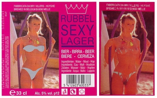
A Huyghe “Golden Girl”, stripped of her dignity
Rubbel Sexy Lager used to be brewed by the large, often-cartoonish Belgian brewer, Huyghe. By all accounts it was a rather poor Pilsner distinguished by the fact that each bottle label featured a photograph of a scantily-clad young woman. Or at least, she appeared to be scantily-clad. In fact, her clothes were the same scratch-off silver covering that you find on bingo cards. If you got out a trusty five euro-cent piece you could enjoy “undressing” her while you drank the beer.
In 2007, the U.K.’s industry-sponsored responsible drinking advocate, The Portman Group, ruled that these labels were in breach of its guidelines because they “suggested an association with sexual success”. The beer was subsequently dropped by its U.K. importers.
The aesthetic of Rubbel Sexy Lager is unappealing – very much at the “page-three” or even soft-porn end of the spectrum – and in the U.K., if not in Belgium, that aesthetic undeniably comes with certain social-class and political associations. It is very easy to disdain it on those terms, let alone on the terms of the beer itself.
But that would be to miss the importance of The Portman Group’s judgement: in noting the “association with sexual success”, it drew attention to the fact that this beer not only presents an aesthetic, but also a narrative. The women (Huyghe’s “Golden Girls”) present themselves to the drinker, compliantly inviting him to “undress” them, just as the beers invite him to pop their tops off and consume them. Moreover, this narrative objectifies these women: they become sex objects, clearly, but more than that, they become personifications of the beer – cheap, casual, there to be consumed and discarded in what is assumed to be a male-only drinking context.
Pointing out that Rubbel Sexy Lager is misogynistic doesn’t really add much to the sum of knowledge, so let’s challenge ourselves a little by turning to the label on another Belgian beer: Brasserie Cantillon’s Rosé de Gambrinus.

Rosé, naked and clothed
There is a naked woman on show, but on the face of it that is where any similarity with Rubbel Sexy Lager ends. The brewery is regarded as one of the leading producers of traditional Lambic, this beer is one of its finest, and the aesthetic of watercolourist Raymond Coumans’ design is far more appealing than Huyghe’s page-three snapshots.
As the beer journalist Michael Jackson put it, “Some regard the label as indecent or sexist, but it perfectly captures the joie-de-vivre under the surface of bourgeois Brussels.”
So, is the narrative any more complex than the crude sexual conquest of Rubbel Sexy Lager? The woman is on top of the man and exudes sexual confidence – she appears to be both teasing and withholding the beer from him. On the other hand, she is naked and he is fully-clothed; he is the mythical “King of Beer”, King Gambrinus, and she is his concubine. Moreover, she is clearly “Rosé”: so again, the narrative is one of objectification, in which the name of the beer draws an association between the woman, her vagina and the beer, all of which are deemed the property of the man, to be consumed by him.
What does the context tell us about which of these narratives is the stronger? As it happens, it tells us a lot, because the fate of Rosé was not sealed when Coumans applied the last brushstroke to his original label artwork.
When Cantillon began to export to the U.S. its import partner said that the design would have to change to be acceptable to Federal regulators. It sent back an example in which Rosé was partly covered up with a black bra and a miniskirt. Coumans was unhappy with this design, so he created a new label for the U.S. market in which Rosé was clothed in a long blue dress. “But most importantly, and the Americans need to know this,” he added, “underneath the dress she’s in the buff.”
All of a sudden, we are not a million miles away from Rubbel Sexy Lager and its scratch-off bingo-card swimwear. The all-male context, with its sexual double standard, uncovers the misogyny behind a potentially sex-positive feminist narrative. Finally, when Shelton Brothers became Cantillon’s importer in 1996 it reinstated the original label, once and for all stripping poor Rosé of her clothes but also, more pertinently, any sense of agency that the narrative had promised her.
By placing Rubbel Sexy Lager and Rosé de Gambrinus alongside one another, we can appreciate how a beer label’s aesthetic stands apart from its underlying sexual politics, the circulation of social energy between its narrative and its context. Indeed, it can often obscure those politics from us, or alienate us from them. It can do so simply by being beautiful, sophisticated or witty; but it can also appeal to an aesthetic tradition as, in itself, a justification for a contentious image, or a way to place historical distance between the image and its sexist implications.

Nautical nouveau from Siren Craft Brew
The marketing imagery adopted by Siren Craft Brew is a good example of an aesthetic that does all of these things. It draws primarily on a potent and very attractively realised combination of the neo-nouveau psychedelia of the late 1960s and a timeless tradition of nautical myth. Its beers “are the sirens of Siren Craft Brew”, each named and depicted on the respective labels, and sexualised to some degree or other – one is named “Liquid Mistress”, for example, while another, “Undercurrent”, is said to have a “silky, creamy body” that “will pull you under”. All “are here to tease”.
The narrative was clear enough, then, even before the era of psychedelic free love was exposed as an era of free-rein for ephebophiles and free-of-consequence sexual assault. There are only men onboard a ship, and these men dichotomise women in accordance with the sexual double standard: the ship itself is a “she”, a domesticated femininity bending to men’s will; while the perils of the ocean are personified by the treacherously seductive sirens and their dangerously untethered sexuality. The two ideas are artfully conflated in the label design for Maiden, the brewery’s annual barrel-aged Barley Wine, which appears to depict a young woman as both siren and ship’s figurehead.

The double standard
With Siren’s beers, therefore, men are allowed the frisson of this assertive female sexuality, but ultimately re-assert their dominance, and the sexual double standard, in the act of consumption – for, once again, the feminine is objectified as a personification of the beer in the taproom, just as the feminine is objectified as the vessel onboard a ship. The underlying assumption is that both brewery and bar are male-only domains, just as surely as an 18th-Century ship was.
In much the same vein, we could identify a number of beers marketed with imagery that harks back to a 1940s wartime aesthetic that includes “pin-up” seductresses painted on the nose cones of military aircraft. These women were, like ships’ figureheads, made to personify the aircraft (and perhaps also some idealised “girl back home” for this temporarily displaced, all-male community of flyboys), often with a punning flourish.

Wordplay and foreplay for an all-male community of flyboys
The aesthetic, the wordplay and the personification-objectification were all honoured in the marketing material for Dorothy Goodbody’s Wholesome Stout, from the Wye Valley Brewery. The brewery’s punning merely made the implied sexual double standard more explicit – but it was able to do so because the aesthetic served to alienate the drinker from the underlying misogyny of the narrative and its context by introducing historical distance. The beauty of the design and the wit of the wordplay can be enjoyed in their own right, it is implied, because the misogynistic context is safely in the past – just as the sexiness of the Dirndl can be divorced from its sexism because a sex-positive feminism has appropriated the aesthetic from an earlier, male-dominated age.
That implication is, at the very least, debatable. It appears, itself, to be the product of a still male-dominated context; and it is difficult to believe that the resulting imagery does anything other than reinforce that male dominance, by appealing mostly or entirely to men. The Dorothy Goodbody narrative circulates much the same kind of social energy as does “Miss Laid”, or Rosé, Liquid Mistress, or any number of Huyghe’s scantily-clad “Golden Girls”.
Wye Valley Brewery seem to have recognised as much when it retired Dorothy from duty on its website, which raises the question of what a brewery ought to do when it realises that its marketing imagery is sexist and unappealing to women.
A recent collaboration between Manchester’s Cloudwater Brew Co and Miami’s J. Wakefield Brewing perfectly illustrates how perilous it can be to adopt a superficial approach to this problem which assumes that the aesthetic and narrative of the imagery can be divorced from its context.
When the collaborative brew was announced, the beer writer and equality campaigner Melissa Cole observed that J. Wakefield “has an appalling record of sexist branding”, and asked Cloudwater, “why are you tacitly condoning this by collabing with it?”

A re-think, or a token gesture?
Cloudwater’s Paul Jones responded by claiming that he had engaged J. Wakefield in a “conversation that cut through to the core of our values”, and that as a result the Miami brewery would “distance themselves from beer artwork that fails to wholly represent the care they otherwise live out in their daily work”. For its part, J. Wakefield withdrew the sexist imagery it had used for its Orange Dreamscicle Sour Ale and replaced it with an older design (although this appeared to be a token gesture in reaction to Melissa Cole picking that label out to illustrate her point, glossing over the fact that it was representative of a large part of the brewery’s other marketing).

Tone deaf
That debate became moot once the collaboration beer was released, and its label (now withdrawn) was revealed. The beer was called Shelf Turds – the name the craft-beer community gives to beers that languish unwanted on bottle-shop shelves – and the label depicted caricatures of Jonathan Wakefield and Paul Jones, in the cartoonish J. Wakefield aesthetic, lying on shelves in their underpants.
Presumably, the intention was to indulge in a little self-deprecating humour that referred back to the sexist-branding controversy. In the terms of my critical framework, Shelf Turds preserved the J. Wakefield aesthetic while intending to change the narrative from one of sexual objectification of women to sexual objectification of men. Of course, it did nothing of the sort. The two men depicted are real people, not idealised icons of manhood meant to personify a beer to be consumed by women, and they have exercised their own agency in deciding to depict themselves in this way. The humour, such as it is, feels aggressive: “See, we can laugh at ourselves, so why can’t you women?”
The extraordinary tone-deafness of this design seemed to be worsened by the fact that Cloudwater’s own marketing aesthetic is impressively sleek, contemporary and sophisticated, and that J. Wakefield employs a woman as its General Manager & Assistant Brewer. Again expressing this in terms of my critical framework, many commentators despaired that, even when consciousness of sexism had been raised, and it had apparently been recognised by two breweries with good reasons to be responsive, the overwhelmingly male-dominated, “frat-boy” cultural context of much of the craft-beer industry and its customer base caused that response to be reflexively misogynistic.
Thankfully, it does not have to be this way. A much more creative and positive solution to the problem of how to preserve a well-known marketing aesthetic while disavowing sexism was recently put forward by Castle Rock Brewery.

Elsie Mo, from nose cone to pilot’s seat
Like Wye Valley’s Dorothy Goodbody ales, and many of the beers produced by Fordham and Dominion in Delaware, the marketing imagery for Castle Rock’s Elsie Mo Golden Ale draws explicitly on the traditional style and wordplay of wartime nose-cone pin-up artwork (the beer’s name derives from the initials of its main ingredient, “Low-Colour Maris Otter” malt).
In 2014, responding to criticism that the imagery was sexist, the brewery re-worked it, “wanting to better integrate the image within the historical context intended”. Here, again, we see an attempt to alienate the aesthetic from its misogyny by emphasising an appropriation from an “historical context” for a knowing, ironic, non-sexist contemporary consumer.
By 2017, however, with the Harvey Weinstein scandal resonating through public life and social media, the brewery had recognised that “the pump clip – in all versions over the years – may have been regarded as offensive”. But instead of simply retiring Elsie in an embarrassed silence, Castle Rock did something rather extraordinary, which at a single stroke recognised that an “historical” or traditional aesthetic cannot truly be divorced from either its historical or contemporary social energies, and that the narrative it supports and the context in which it is produced and consumed are absolutely central to the circulation of those social energies.
The press release announcing the re-brand is worth citing at length:
The new pump clip for Elsie is designed to celebrate the will and bravery [of] women, both in times gone by and today, without losing its original heritage. We’ve taken inspiration from the women pilots of the second world war, who took to the skies in Spitfires, Lancasters and Hurricanes, to deliver battle-ready planes to fighter pilots of the RAF.
We worked closely with our designer, Nick Pettit, to ensure the new pump clip is spot on. Nick is a brand specialist in the brewing industry and studied imagery and propaganda of the World Wars as his art school thesis, so this was a project that we were all very invested in.
We were especially influenced by Giles Whittell’s Spitfire Women of World War II, published in 2008. The collection focuses on true stories from the women of the ATA (Air Transport Auxiliary) who, although not allowed into combat, flew unarmed – without radios or instruments, and at the mercy of the weather and enemy aircraft – to deliver planes to the front lines. There are stories and photographs of these women, featuring famous names like Amy Johnson and Maureen Dunlop among those of unsung heroes. We worked to capture the bravery of the women of the ATA, and the confidence they exude in these photographs, to inspire a pump clip that we can all be proud of. Most importantly, Elsie’s now in the pilot’s seat, where perhaps she should have been all along.
While the new design continues to pay homage to the war effort and the unsung bravery of these pilots, we also want it to be an empowering image – to be a pump clip that proudly celebrates women in all industries, including our own, as well as being an inspirational image for all.
The narrative has been completely renovated to become resolutely feminist. The twin contexts of “times gone by and today” are explicitly recognised, as is the specific importance of empowering women and fostering equality in the contemporary beer industry. This is a clear and welcome recognition of the social energies that really underlie the contention around beer-marketing imagery, rather than an attempt to obscure these social energies by appealing to aesthetics or tradition.
Moreover, by naming Amy Johnson and Maureen Dunlop alongside the fictional Elsie Mo, the brewery avoided the trap of making Elsie a vague, de-personalised idealisation of wartime heroism, a mere cipher that would have been as much an objectification as “Miss Laid”. Instead, it has imbued Elsie with life and agency: she is a subject now, not an object; by moving from the nose cone to the pilot’s seat, she no longer merely personifies the beer that shares her name, but becomes something more like its brand ambassador.
Earlier in this article I asked the reader not to assume that I selected these labels for analysis because I consider them to be particularly egregious examples of sexism or misogyny. In fact, I selected some of them precisely because their sexism is not egregious, but subtle, complex and almost certainly unintended.
I did this to show that Justice Stewart’s “I know it when I see it” heuristic does not work when it comes to identifying sexist imagery. It fails because the 50% of us who, almost by definition, are not directly affected by sexism, tend to assume that sexist imagery will use a set of recognisable aesthetics. It does not. It does, however, deploy a set of recognisable narratives (sexual compliance and personification-objectification); and originate in recognisable producer-consumer contexts (male-dominated).
For obvious reasons this is clearer to many women than it is to many men. Men, in the beer world but also in all other walks of life, owe it to women to learn to read these narratives critically and to acknowledge, and seek to change, the contexts in which they are produced and consumed. Only then can we change the social energies circulated by our culture. Or, to put it in less formal, analytic terms, only then will men and women genuinely be able to enjoy a beer together.

Another post bursting at the goiters with information! I don’t agree with some of your reflections in this but again, it’s one of the most insightful, thoughtful – and above all – well-researched blog posts I’ve read in a long time. Research is your forté. I’d never even heard of or seen most of the examples you give.
I have a question for you:
As someone who is half-French (I lived and went to school in France for 3 years), do you think the British or Anglo-Saxon (it’s how the French refer to any written/spoken English culture) mindset is particularly squeamish when it comes to sensuous/erotic depictions? I think in European cultures it’s much more integrated.
LikeLike
Thanks again!
Are Anglo Saxons more “squeamish” about eroticism? Hmmm… Well, first of all I would emphasise that calling out misogyny isn’t the same as squeamishness about eroticism, but that said… I think you are right, as a generality, but that it is much broader than attitudes to sex and the erotic. Anglo Saxons tend to be less scatalogical, sweary, outspoken… Basically more phlegmatic and more oblique. Taking up your point about Anglo Saxon language, think about how important litotes is as a rhetorical mode in (Old) English, and how the double negative features prominently when English people want to express themselves most forcefully. It’s not about attitudes to sex, but about attitudes to immediacy of feeling and experience of any kind. Anglo Saxons never say what they mean, or what they feel. Abandon is a completely alien mode to them. They instinctively pay wergeld rather than exact bloody revenge…
LikeLike
I’m afraid I find this over-interpreted. For me, *agency* is at least as important as the three critical dimensions you adopt. How do you determine whether the use of a woman in a dirndl is sexist? Not by the mere presence of a dirndl. By whether or not the woman wearing it on the label has agency. Was she placed there for the amusement of men? Sexist, for sure. But I’d the context is neutral and you still declare the image sexist, you replace your judgment for the image’s. You rob the expression of agency. This is its own form of sexism.
It’s far from easy to make this distinction, and I don’t claim to be an authoritative arbiter. But sexuality has agency, and while the images of feminine sexuality has historically been used as a plaything of men, it need not be so.
LikeLike
Thanks for taking the time to comment, Jeff.
I think the question about whether this is overdetermined is difficult to address, as it is pretty subjective. You clearly think so. I suppose I would say that if it stimulates anyone to reflection then I think it is fair to say that, while any part of the argument might be overdetermined, the same cannot be said of the whole. I would also observe that your substantive point about agency appears to call for an additional layer of critical interpretation, rather than show how the argument could be simplified.
To address the substantive point I would contend that I took some pains explicitly to consider female agency. Your argument is a form of the one associated with the 1980s sex-positive feminists, whom I acknowledge in my scene-setting discussion of the Dirndl. I then note that it is possible for women to “appropriate” symbols such as the Dirndl in feminist ways, and acknowledge that the Dirndl probably means something different today than it did in 1820, due to that appropriation. I make a similar move in the discussion of the Rose de Gambrinus label, explicitly acknowledging that the image allows a narrative in which the woman depicted exerts agency, but that this agency is stripped away when the narrative is read against its context.
Indeed, the nub of the article is that much (though clearly not all) of the material examined has the potential to support narratives of female agency, but that its context betrays that potential or reveals it to be an illusion: the reason being that the context remains male-dominated – an arena in which women are often barely present, let alone exercising agency.
LikeLike
Well, overdetermined or not, it’s great that we’re dicussing it!
Last, brief comment. When you travel to 21st century Bavaria now, you find men wearing dirndls and men wearing lederhosen. (Women get the better of this deal in my view; no man looks good in lederhosen.) Women in 21st century Bavaria have agency to dress as they wish, which necessarily changes how we must think about the drndl. Third-wave feminism may have glossed over some of the latent societal misogyny when they talked about sex-positive expressions of fashion, but they also highlighted how important agency is in the mix. Whether it’s more more complex to consider or not, I think you absolutely must do so. Otherwise you risk the equally sexist error of paternalism.
Okay, not that brief.
LikeLike
Pingback: Can We Read a Beer in the Same Way We Read a Book? | Pursuit of Abbeyness